TONE POEM - the hole LA
Group show
June 29th–August 31th, 2024
Aiste Stancikaite, Alexis Mata, Alison Blickle, Amy Lincoln, Austin Lee, Ben Sanders, Eric Shaw, Charline Tyberghein, Daniel Byrd, Felipe Pantone, Gavin Lynch, Jackie Head, JJ Manford, Joe Reihsen, Laurens Legiers, Luke Diiorio, Marina Kappos, Matt Phillips, Michael Craik, Nathan Ritterspusch, Nick Thomm, Peter Mohall, Paul Riedmüller, Richard Burton, Russell Tyler, Ryan Crotty, Sally Kindberg, Seffa Klein, Thomas Trum, Tim Biskup and Tim Brawner
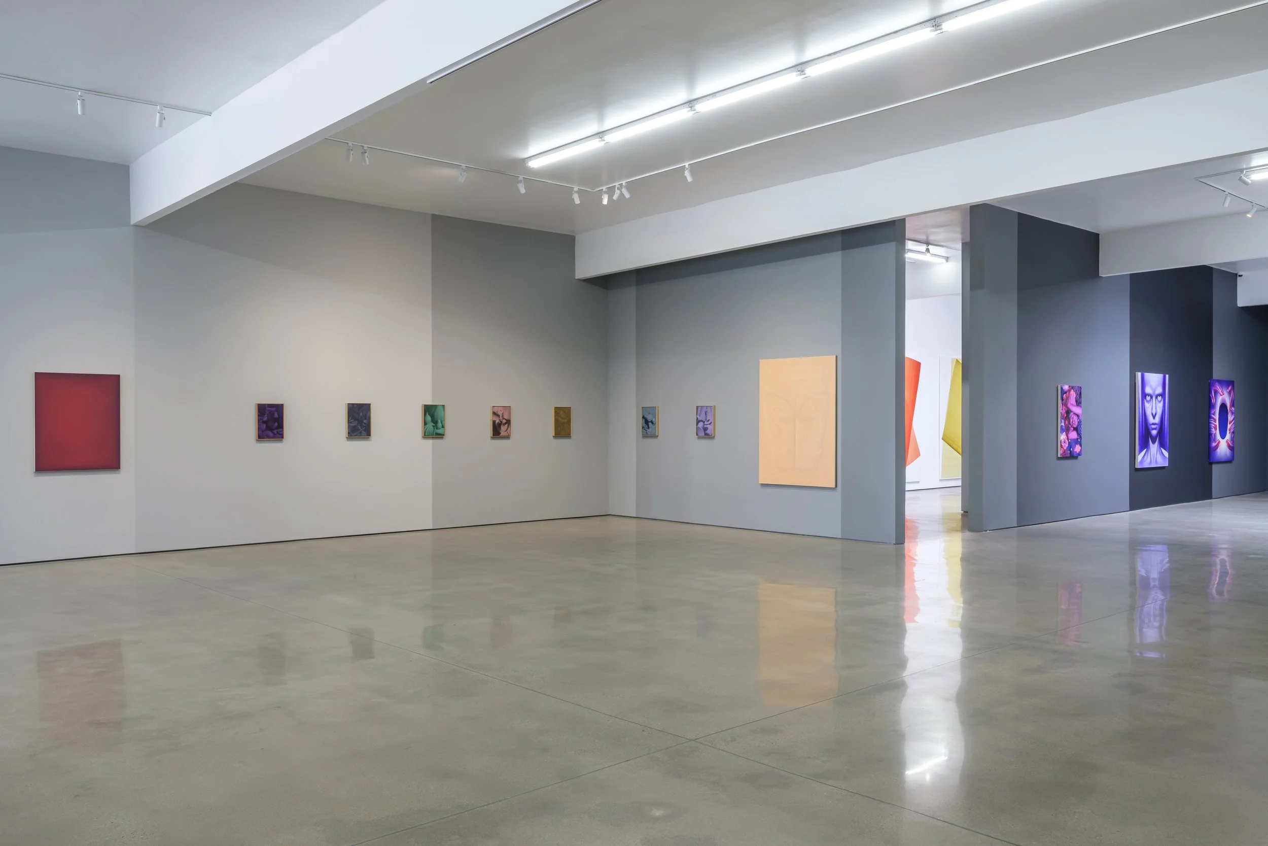
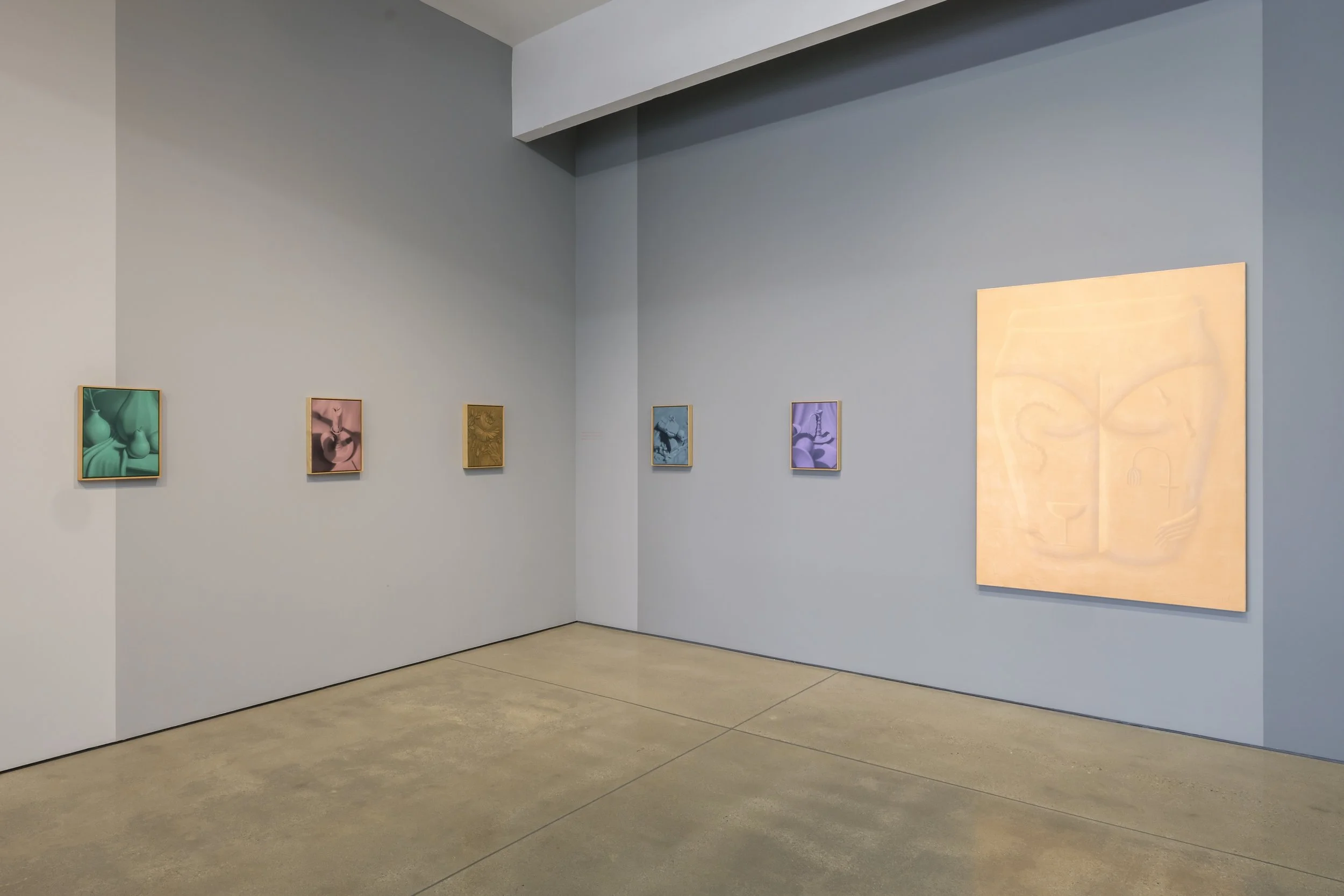
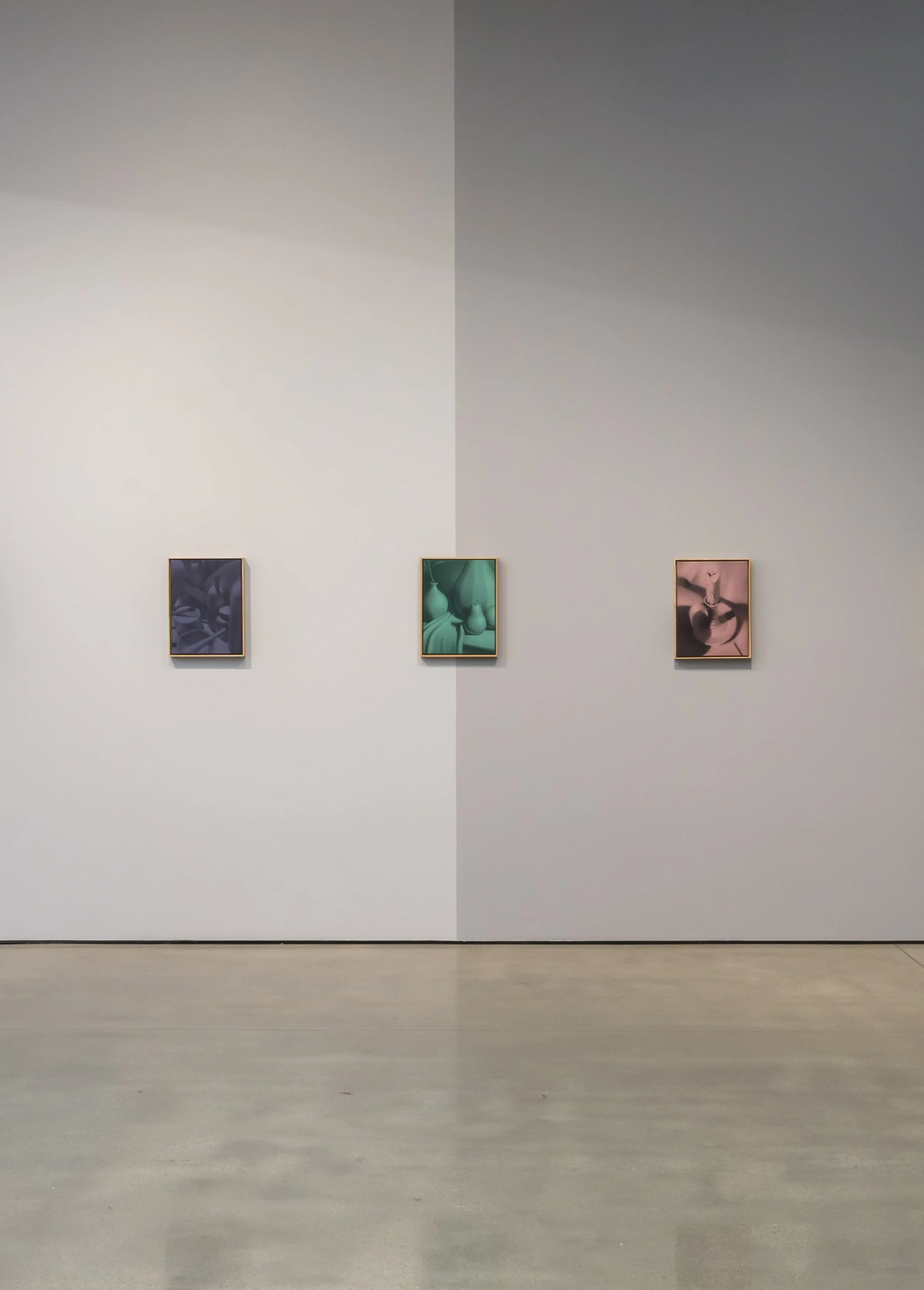
The Hole is proud to present our summer group show in Los Angeles, Tone Poem. Including only works that exist within a tight tonal range, this exhibition includes many monochromes as well as what you could call “limited palette” or reduced palette paintings. With just a few colors—or one color in many tones—the works in this show look at the evocative potential of color limitations. Across the greyscale-painted gallery, abstract and representational works coexist; natural enemies sharing a wall in what we hope is a poetic way.
While many people use terms like “hue”, “color”, “tint” and “shade” interchangeably, Tone Poem is a good excuse to brush up on your color theory (as I had to before writing this lol). Tint refers to any hue or mixture of pure colors to which white is added, as we see in the glowing forms of Aiste Stancikaite. Tone would technically be a hue or mixture of pure colors to which only "pure" gray is added (equal amounts of black and white) which we think plays some part in the lovely work of Paul Riedmüeller above. Shade is defined as a hue or mixture of pure colors to which only black is added, darkening the color with the hue remaining the same, as we see in the trompe l'oeil shadow-work of Charline Tyberghein’s paintings.
For some artists their use of color is intuitive after years of mixing oils and acrylic; tone, tint and shade become ingrained, like becoming fluent in a language. Many young figurative artists are into monochrome, perhaps preferring the content of the image over the "distraction" of color. And for the abstract composers, where color is often the source of the content and the drama, they choose to play one note in a complex and nuanced way. A reduced palette is a way to get to play a chord, perhaps: Daniel Byrd weaves just three colors together to see how they get along. A mostly-red work by Matt Phillips makes the introduction of a bit of green and blue feel bold, or Russell Tyler who has made whole bodies of work with just teal, salmon and black.
Certainly the artworks have a playful tone: within these self-imposed restrictions we see a bit of showing off, too! In the two Peter Mohall Untitled (Brushstrokes Painting) paintings we see a burlesquing of color theory, an investigation of the painterly authenticity of the artist's hand in relation to the automatic and repetitive. While Felipe Pantone utilizes modeling software to map out his moire effects in 3D (and uses the audience to activate his dazzling kinetic pieces), in Jackie Head’s Mango Violet Blend we see the mathematics and scientific precision of color, using the tiniest differential in pigments and chemicals of her glaze to create the smoothest gradient and color changes in slip-cast porcelain.
On the figurative team, Alison Blickle Eclipsed captures mood and time of day through a hot pink haze. While Nathan Ritterpusch Cowboy #3's greyscale palette evokes early black and white Western films and Tim Brawner Character Head 1, uses purple monochrome to summon science fiction vibes. Sally Kindberg Tightrope contributes a tight palette of mostly eggplant, Gavin Lynch gives us every shade of green in his waterfall painting, and Richard Burton evokes a contemporary ennui in his shade of blue and purple depicting empty train seats.
Abstraction with reduced colors lets you focus on form, composition, or just the color itself as the protagonist. This pale horse by normally-bright-hued Eric Shaw allows us to look at the forms and motion and unbelievable painting technique even more clearly than when the eye is dazzled by every color of the rainbow. Michael Craik layers up thin coats of multiple colors meticulously to make the final mostly-maroon work hum like a low wattage bulb. And Nick Thomm invites us to disappear in the dark blue glow of The Arch, where a thin hot pink edge sets off the deep azure center.
I have a lot more to say about each artist included but we have to get the word out now for this weekend's opening. If you visit the gallery you will be treated to a longer text, and get to see whether our little experiment worked. My guess is that when we turn the polychromatic noise down a bit, we will find that we are all playing in the same key.


